Artist Statement
Alex Stryker
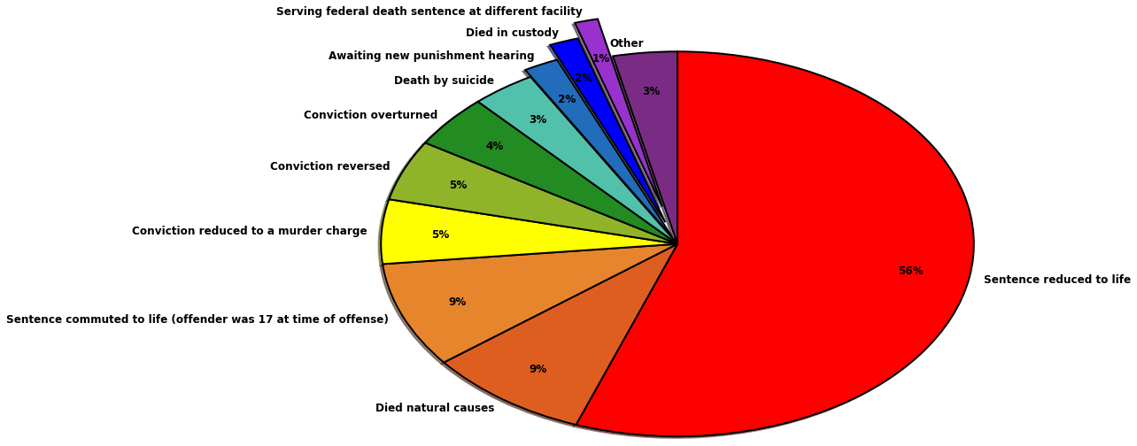
For this group project, I analyzed a dataset explaining why about 300 Texas prisoners who were sentenced to death were no longer on death row. The data spans over 40 years (from 1974 to 2016) and includes detailed information on why individuals were removed, whether their sentence was reduced, their conviction was overturned, they died, or any other reason. For my visualization, I decided a pie chart would be most effective; this type of chart can display not only the most common reasons prisoners were no longer on death row, but it shows the frequency of each reason relative to other explanations.
I took my dataset from the Texas Department of Criminal Justice’s website. Though the data was well-organized, I found it challenging to work the information into a pie chart-friendly format. I was already comfortable with making pie charts with matplotlib, so organizing the material was the hardest and most time-consuming aspect of my project contribution.
I took several steps to sort all the data into something I could work with. I first used the website ConvertCSV to reformat the data chart into a CSV, as this would allow me to reorganize and work with the information in Jupyter. The data was almost too thorough, though, including prisoner’s numbers, names of courts that issued convictions, and more. This made organizing the data into groups difficult, but I needed streamlined categories to make each “slice” in the pie chart. To help, I used OpenRefine, a program one of my group mates suggested to me. The program grouped similar entries together and allowed me to rename them into one category (for example, I took “sentence reduced to life with two more life sentences” and “sentence commuted from death to life” and renamed them both “sentence reduced to life”). For several entries that were only slightly dissimilar, I manually changed the wordings in Excel. After all of this, I had a workable dataset.
Even after all of this work, I had some entries that simply didn’t fit into other categories (such as “died (drowned) while on escape from the TDCJ"). There were too many of these anomalies to leave them in the pie chart, as they were too small in this large dataset to be significant, and they cluttered up the visualization, making the rest of the information harder to read. To remedy this, Matt helped me import a counter function that removed the delimiter from each entry and append any entry that occurred only once to an “other” category. This created a slice specifically for the smattering of entries that didn’t fit elsewhere. The “other” slice did end up being larger than some of the other, more specific slices, but I thought it was important to flag that very few prisoners were merely awaiting a new hearing, died in a nonspecific way, or were still on death row somewhere else.
The results of this endeavor were mostly unsurprising. The vast majority of prisoners either had their sentence or conviction reduced (usually to life) or simply died before they could serve their sentence (the death row system is not known for efficiency). However, there are a surprising number of prisoners whose sentences were reduced from death to life specifically because they were 17 when they committed their crime. Based on this data, that means there are a large number of people in Texas who will spend the vast majority of their lives in prison because of something they did as an adolescent. I’m curious what these sentences cost the state over the course of each prisoner’s lifetime. This is worth exploring, perhaps in a future project — it’s common knowledge that keeping people imprisoned isn’t cheap, but that’s the fate for most individuals in Texas who were initially sentenced to death.